Documentation
Getting started
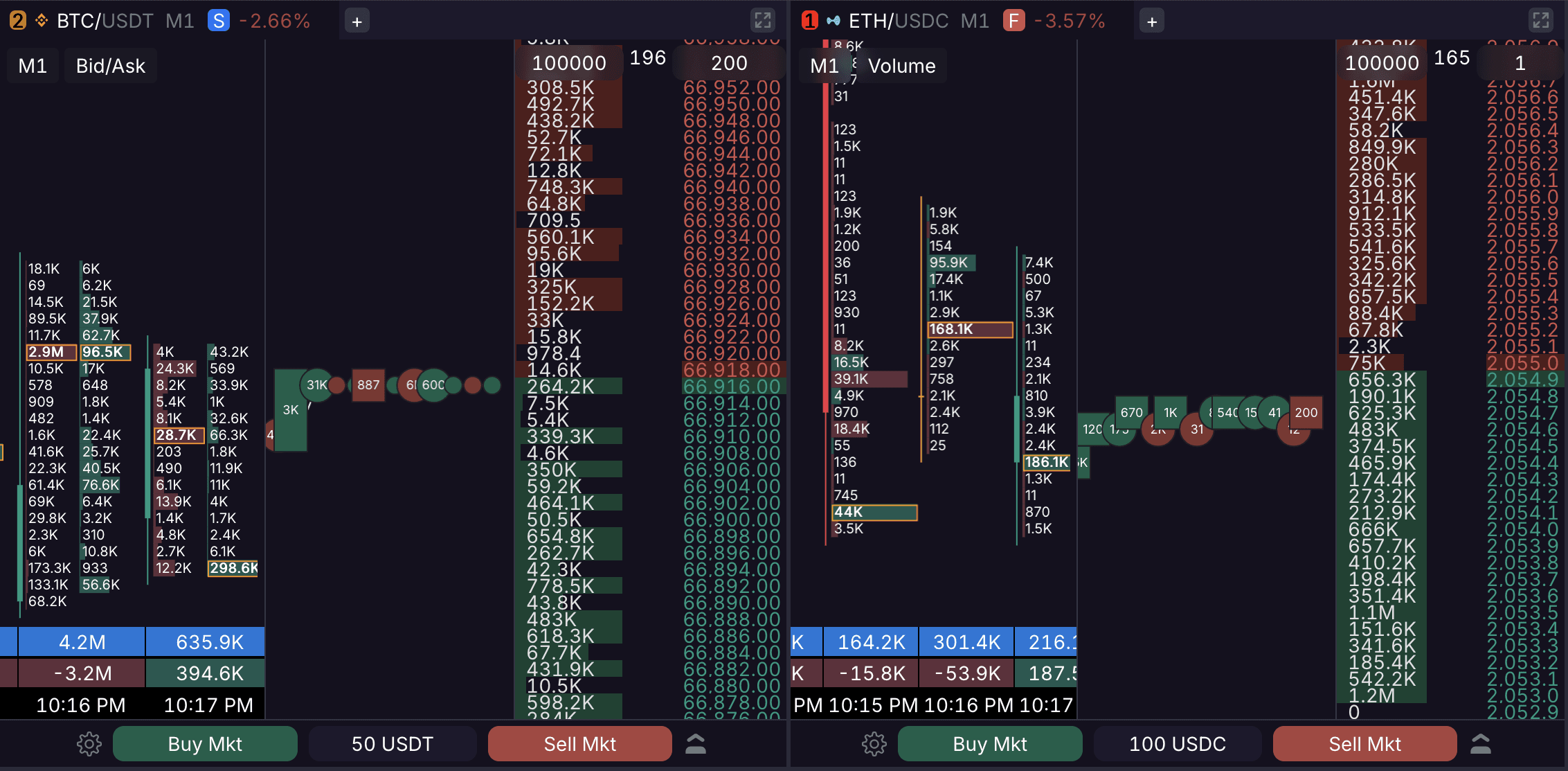
Cluster Chart
A cluster chart displays traded volume distributed across specific price levels within a standard candlestick. It provides a detailed view of buyer and seller activity at every price step.
1. Display Modes
Skalpy offers two cluster visualization modes:
Volume: Displays the total traded volume. By default, clusters are colored based on the dominance of buy or sell volume.
Bid x Ask: Splits the volume into two separate histograms for each price level, displaying market buys and sells independently.
2. Format & Settings
For better readability, Skalpy uses a minimalist histogram format. The candle body and wicks are displayed to the left of the histogram.
Largest Cluster Highlight: The cluster with the highest volume in each candle is highlighted with a border.
100% Fill Logic: By default (when set to "0"), the maximum value for a 100% histogram fill is based on the largest cluster volume within the current candle (the highlighted one).
3. Candle Data
Below each cluster candle, three metrics are displayed:
Total Volume: The total traded volume within the candle.
Delta: The net difference between buys and sells (colored by side).
Time: The closing time of the candle based on the selected timeframe.
4. Timeframes
Cluster charts support the following timeframes: 1d, 4h, 1h, 30m, 15m, 10m, 5m, 3m, 1m, 30s, 15s.
5. Cluster Auto-Collapse
To maintain readability at all times, cluster charts feature an automatic collapse mechanic. When zooming out to a point where the numerical cluster data becomes unreadable, the clusters will automatically hide, transforming the view into a standard candlestick chart without the horizontal volume bars.
6. Using Clusters in Trading
Cluster analysis helps accurately assess market mechanics in real time:
Level Confirmation: Large clusters form zones of interest that may act as local support or resistance levels in the future.
Spotting Deceleration: The appearance of anomalously large clusters at price extremes (after a strong move) without further progression often signals price deceleration against heavy limit liquidity.